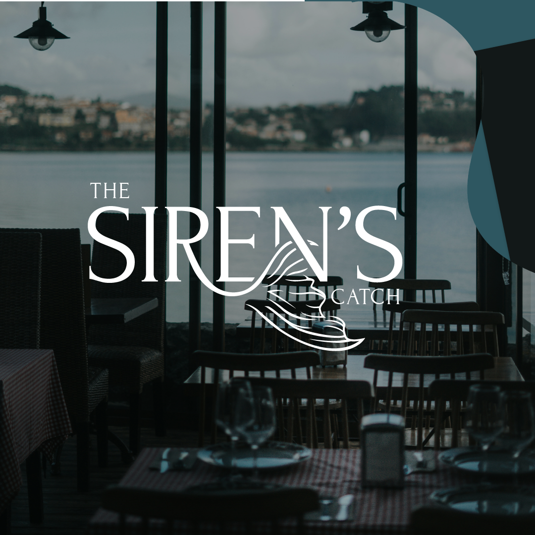
The Siren’s Catch

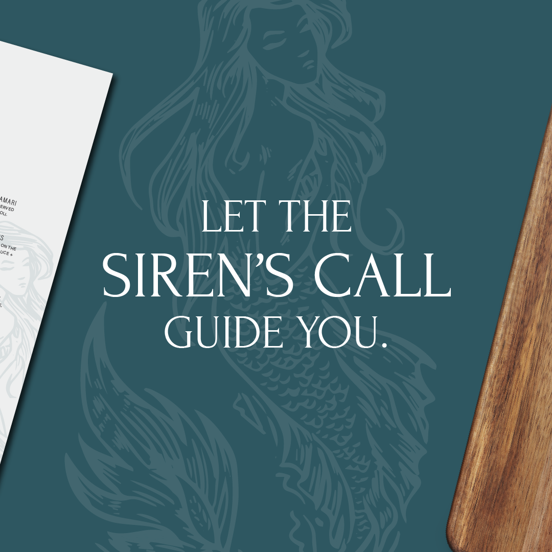
Let the Siren’s Call
Guide You.
Branding Package Project // The Siren’s Catch
A restaurant that invites people to enjoy seafood in a coastal setting near the sea. The serve delicious dishes made from fresh seafood. Whether you go for the catch of the day or one of their special creations, each dish is prepared to satisfy seafood lovers.
Branding Project Included:
Logo Design
Brand Identity
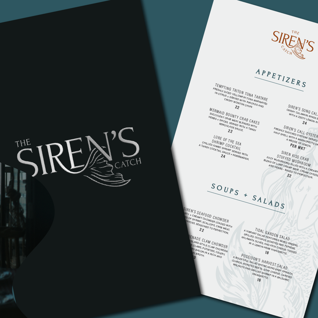
Menu Cards

Logo Design
Logo creation was made with 2 main points in mind: Siren + Chic
The logo for 'The Siren's Catch' blends modernity with maritime allure, featuring a bold sans-serif font with 'Siren' emphasized in size to draw immediate attention. The focal point lies in the graceful curve of a mermaid tail emerging from the 'R,' seamlessly capturing the enchantment of the mythical siren. This design not only pays homage to the thematic inspiration but also invites patrons to immerse themselves in a dining experience where the allure of the sea meets culinary delight, encapsulating the essence of our restaurant in a single, captivating image.
Color Palette
Each hue in the Esplora color palette is carefully selected to embody the essence of luxury, nature, and femininity, resonating with the target audience while infusing their brand with timeless elegance and organic charm.
DEEP ABYSS
This color was chosen for its deep and sophisticated presence, evoking the mysterious depths of the ocean. Its rich darkness conveys elegance and refinement, setting the tone for an upscale dining experience.
OCEANIC TEAL
This color was chosen for its tranquil yet dynamic presence conveys a sense of adventure and sophistication, capturing the essence of 'The Siren's Catch' and enhancing the brand's connection to the sea.
AQUA MARINE
Chosen for its tranquil and refreshing qualities, reminiscent of the calm waters of the ocean on a clear day, and evoking a sense of serenity and harmony. Its subtle blend of blue and green hues embodies the maritime theme, adding a touch of elegance and sophistication to the brand's visual identity.
SEASHELL BROWN
Chosen for its warm and earthy tones, reminiscent of sun-kissed sands and weathered driftwood, and evoking a sense of coastal charm and natural beauty. Its rustic elegance adds depth, warmth and authenticity into the visual identity.
SUNSET
Selected for its warm and inviting tones, reminiscent of the sun setting over the horizon, and imparting a sense of cozy coastal charm and rustic allure. Its rich caramel hue adds depth and warmth to the branding of 'The Siren's Catch,' evoking the earthy tones of driftwood and sand dunes.


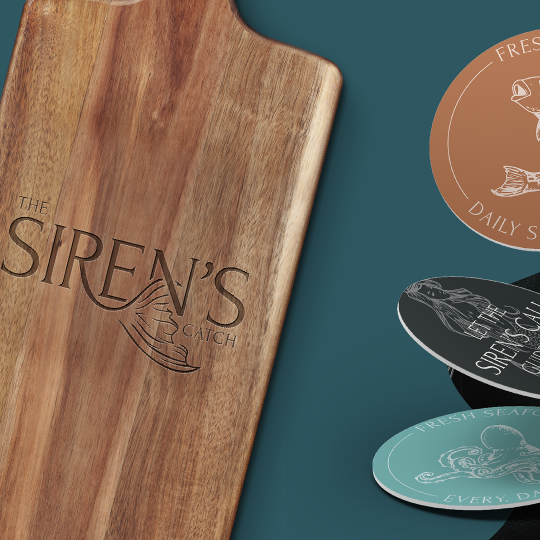
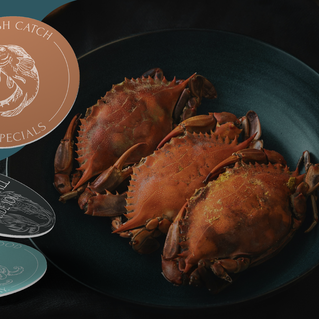
Coaster Design


Each hue in the Esplora color palette is carefully selected to embody the essence of luxury, nature, and femininity, resonating with the target audience while infusing their brand with timeless elegance and organic charm.