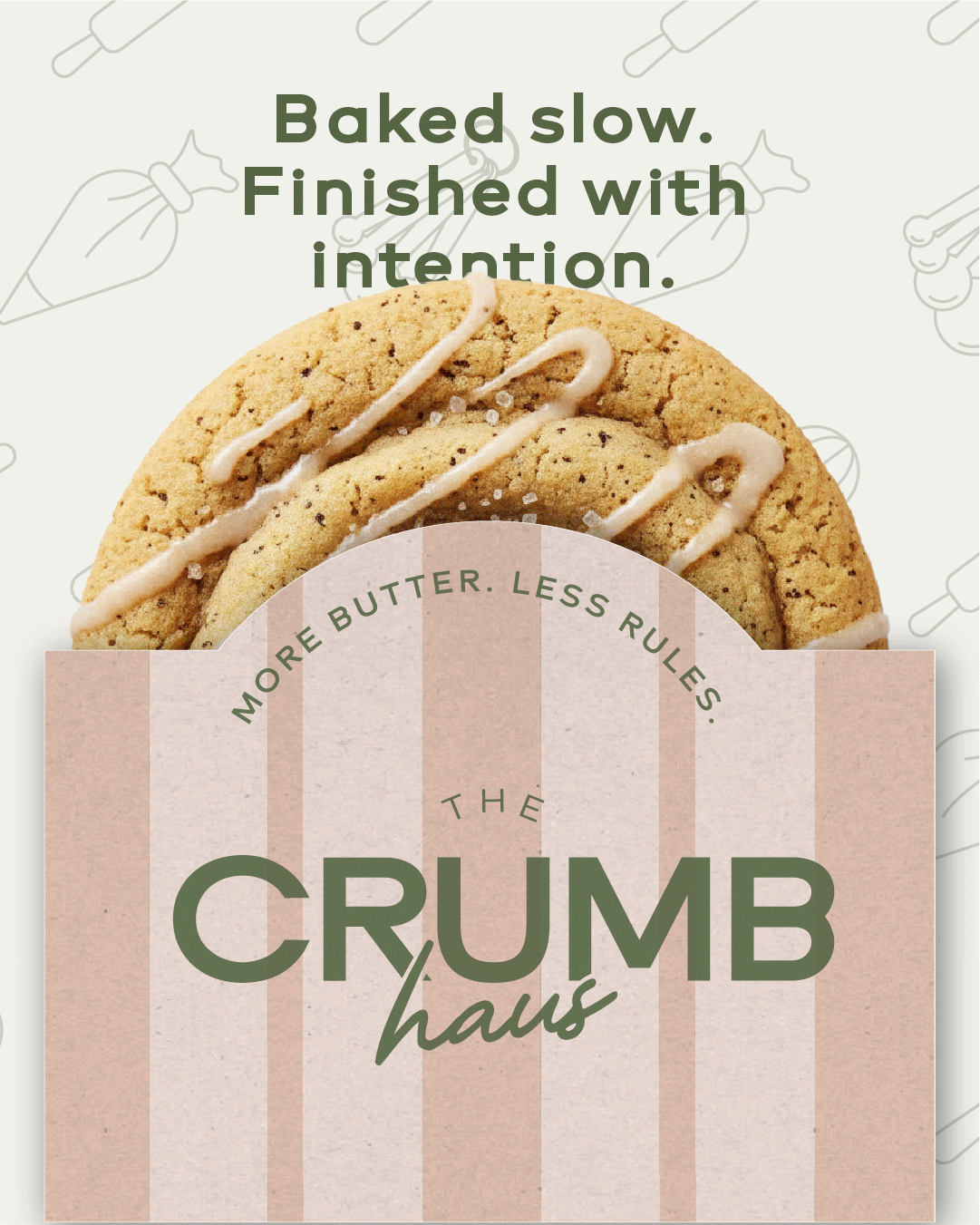

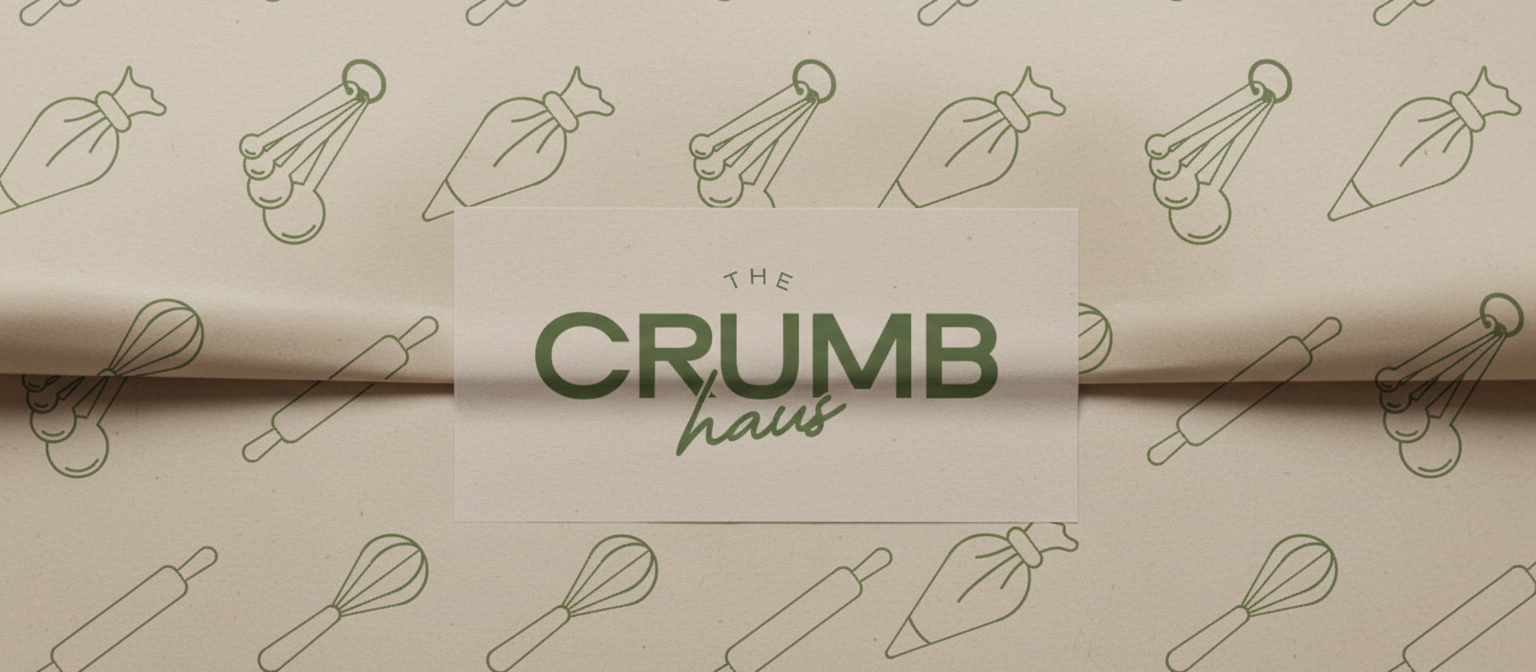
The Crumb Haus
The Crumb Haus is a playful yet refined bakery brand that blends everyday comfort with thoughtful design. Rooted in the warmth of home baking, the identity explores how charm and structure come together through bold typography, a soft color palette, and custom illustrative details - elevating a familiar category with intention.
BRAND IDENTITY
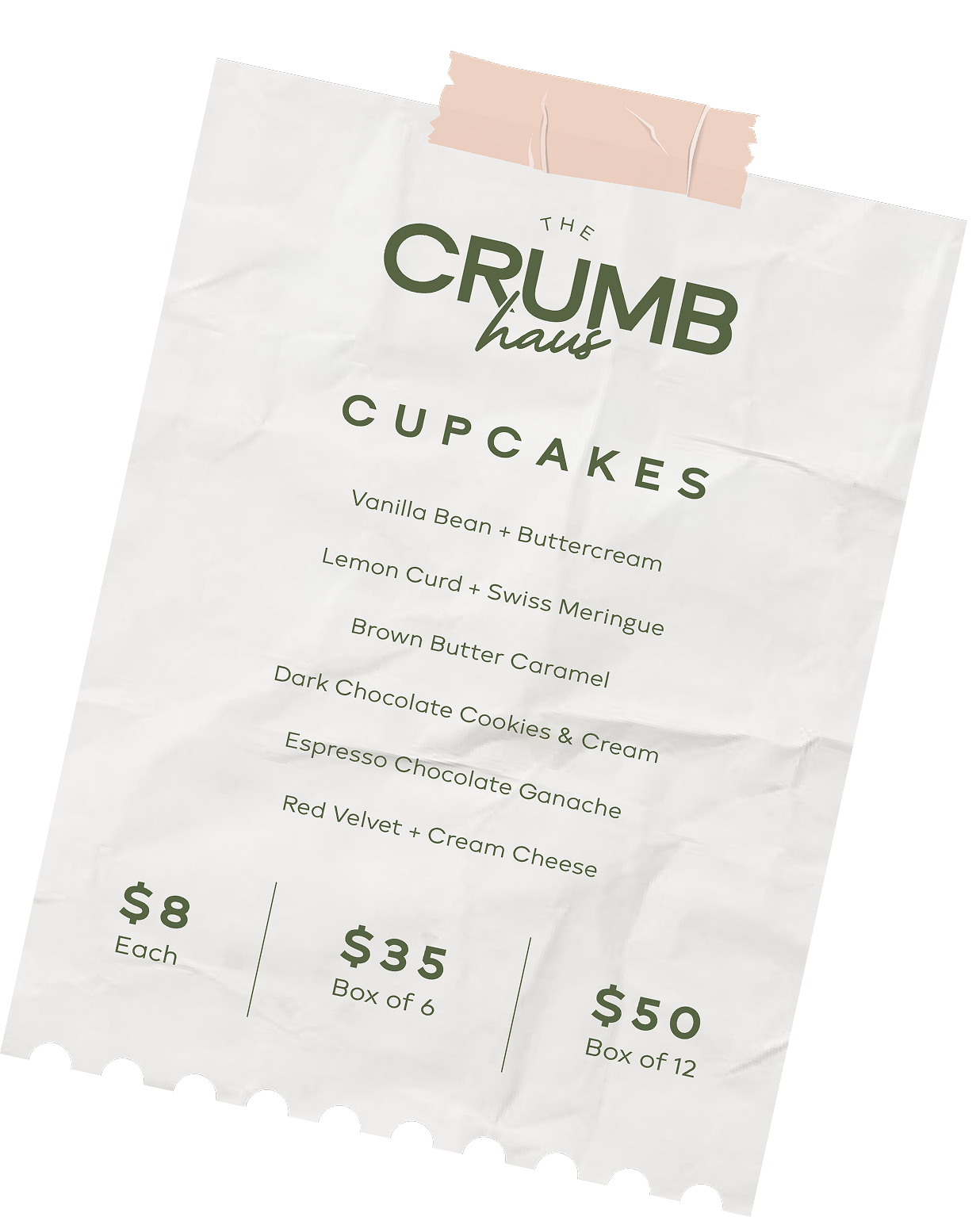
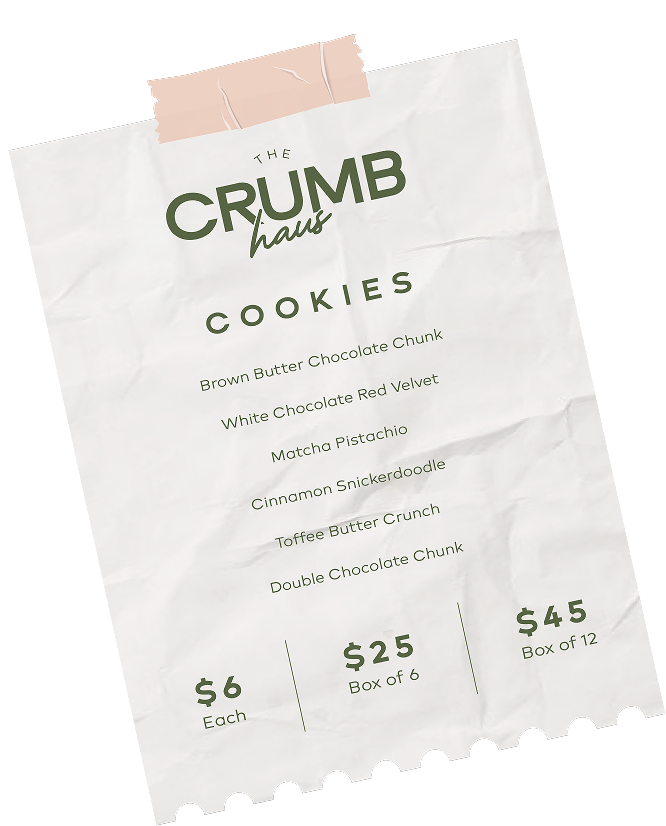
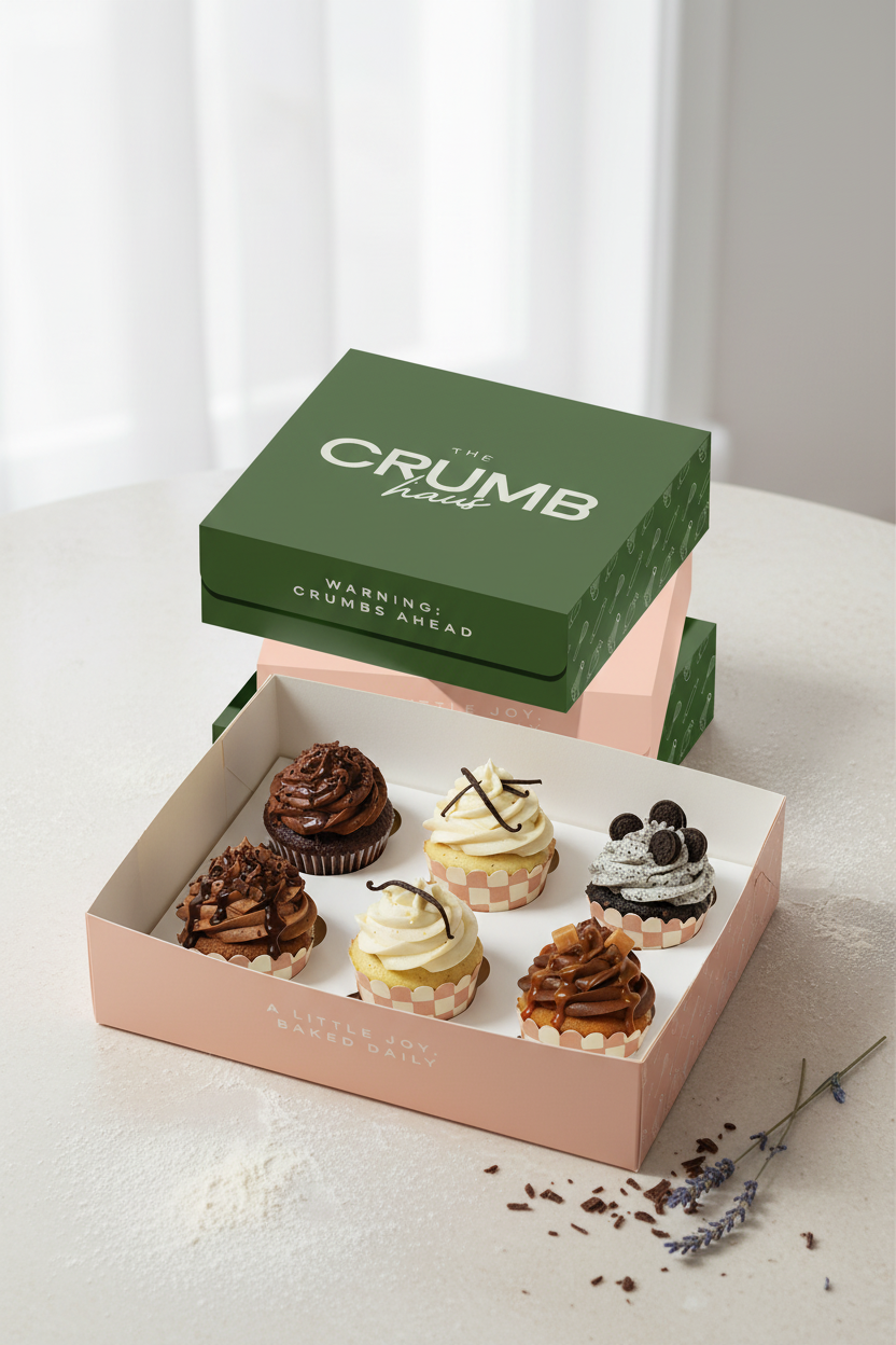
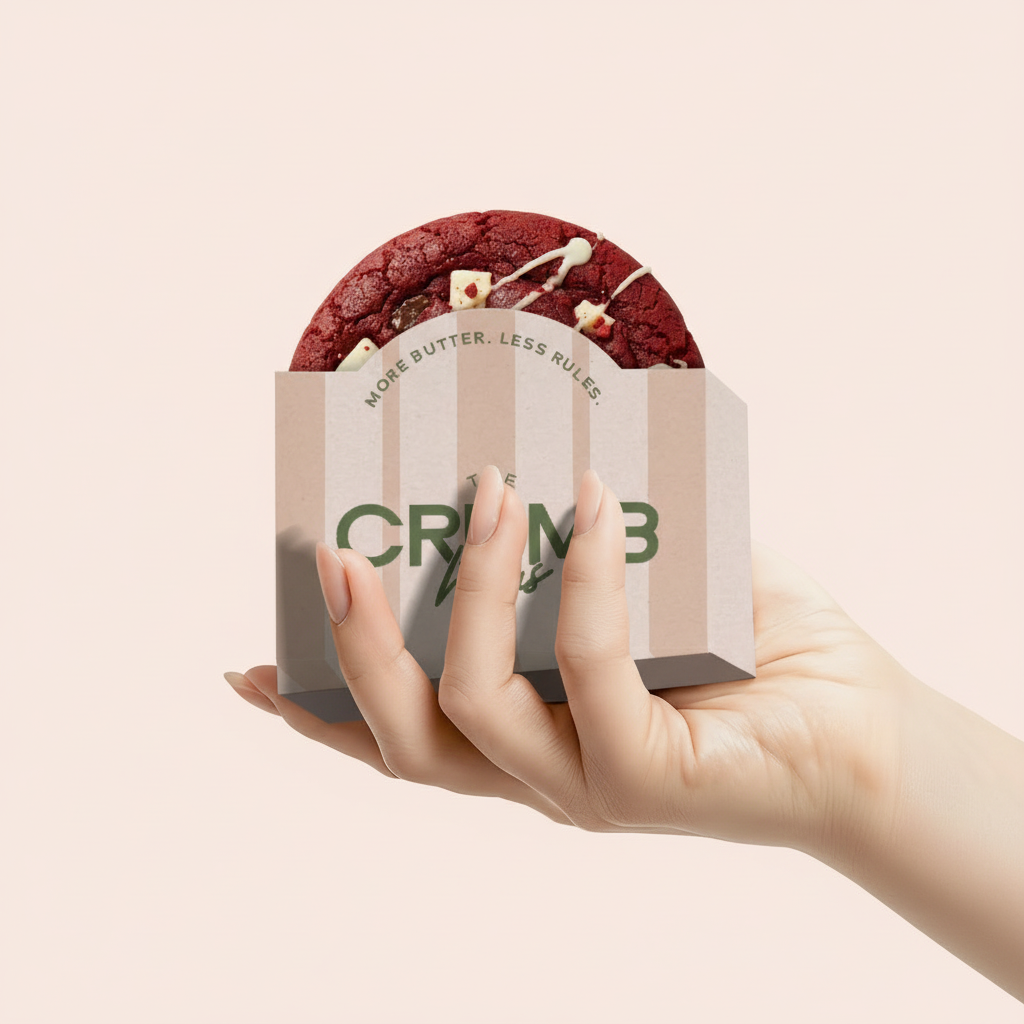
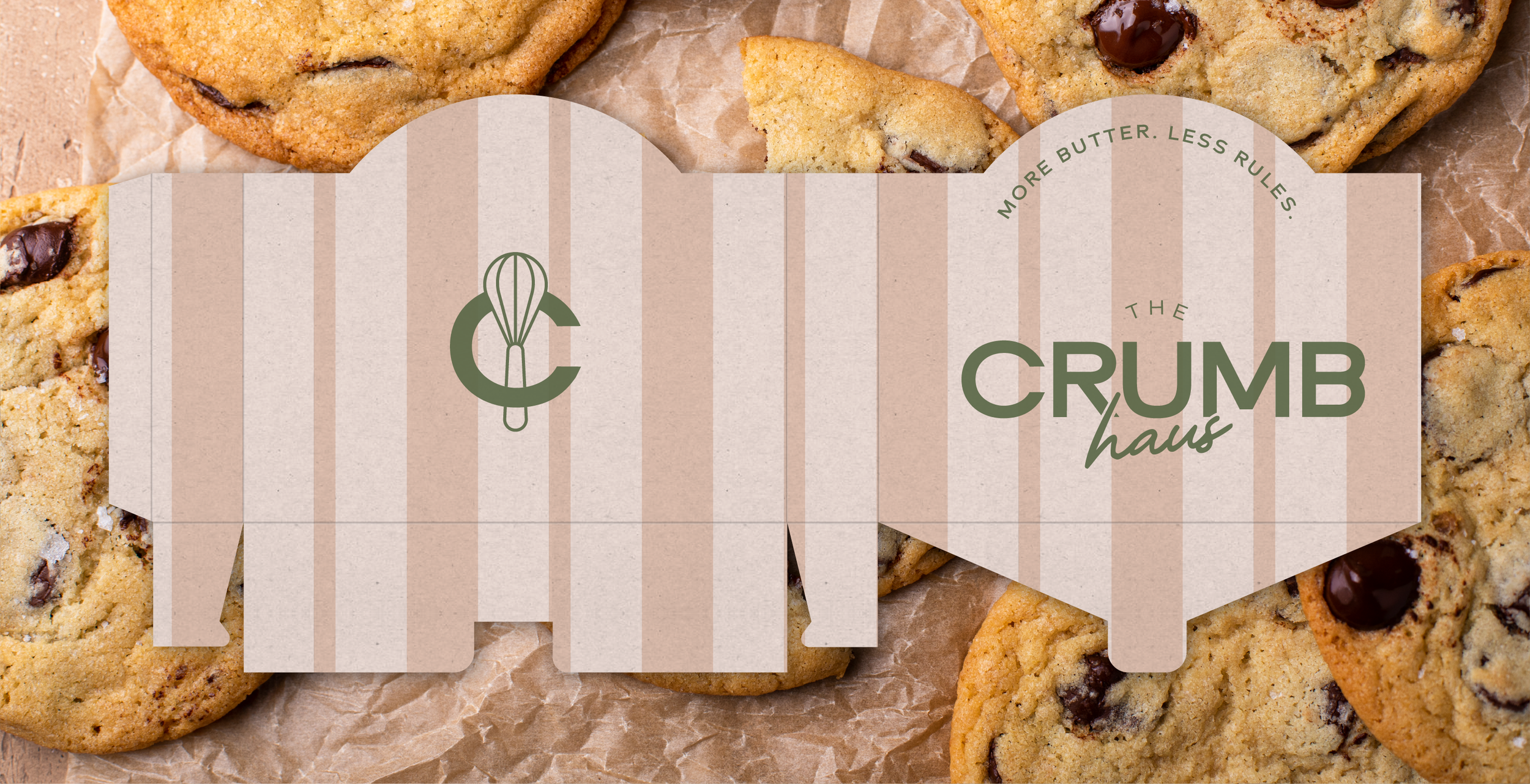
PACKAGING
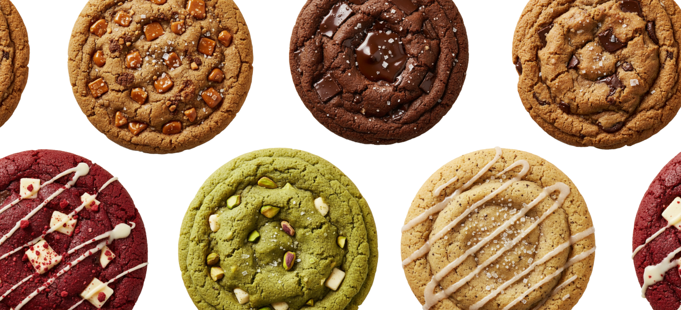
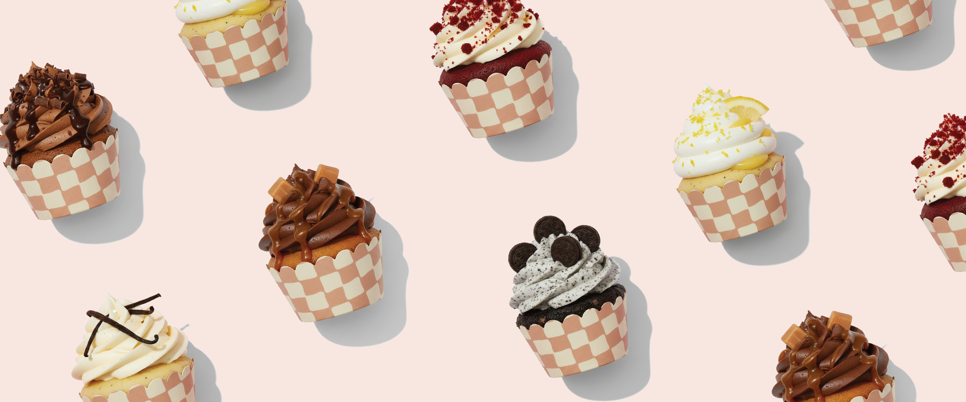
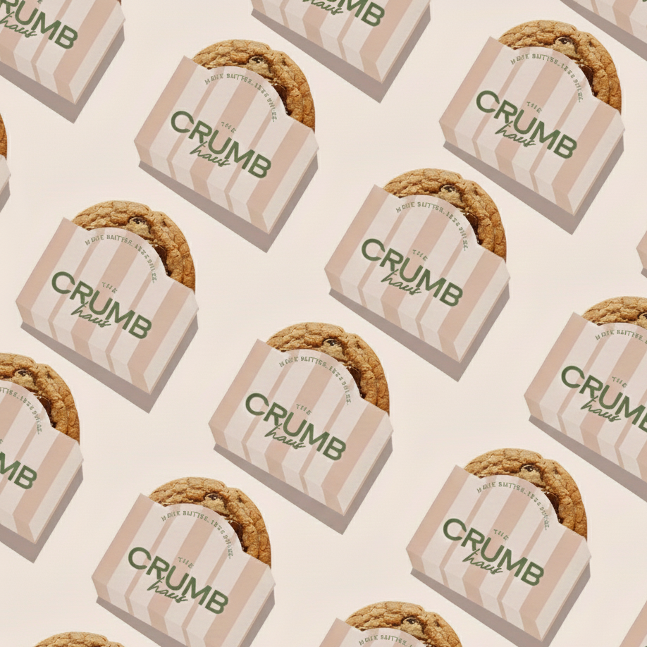
PATTERN SYSTEM
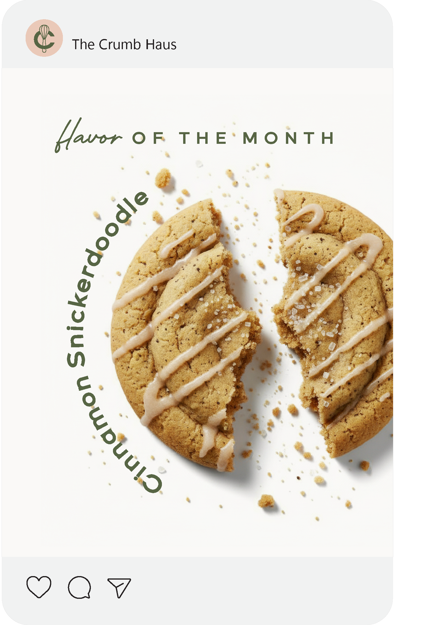
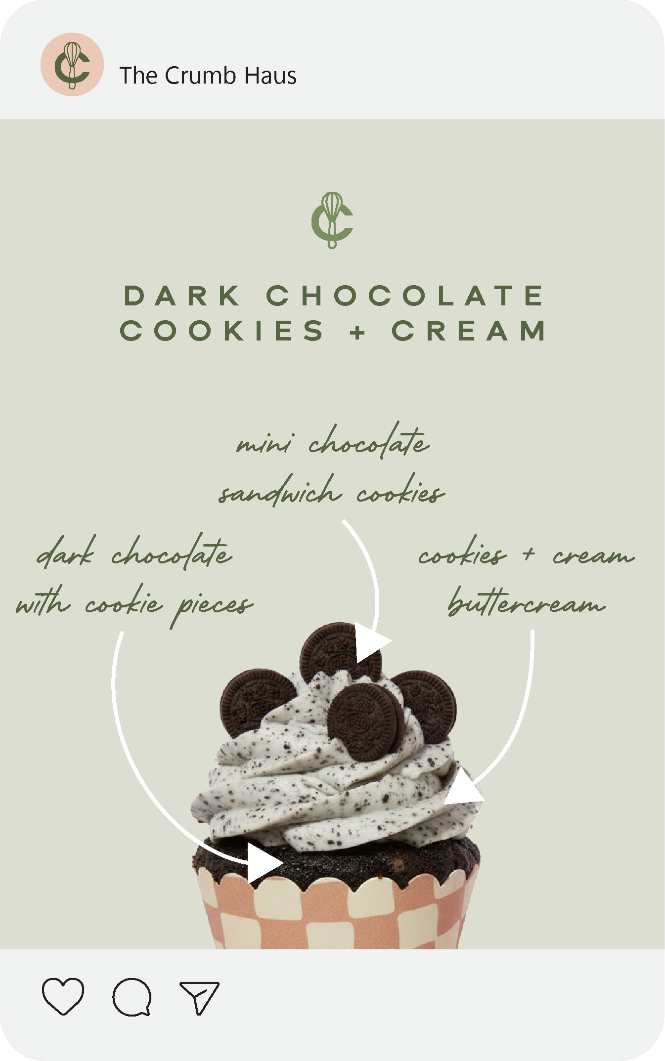
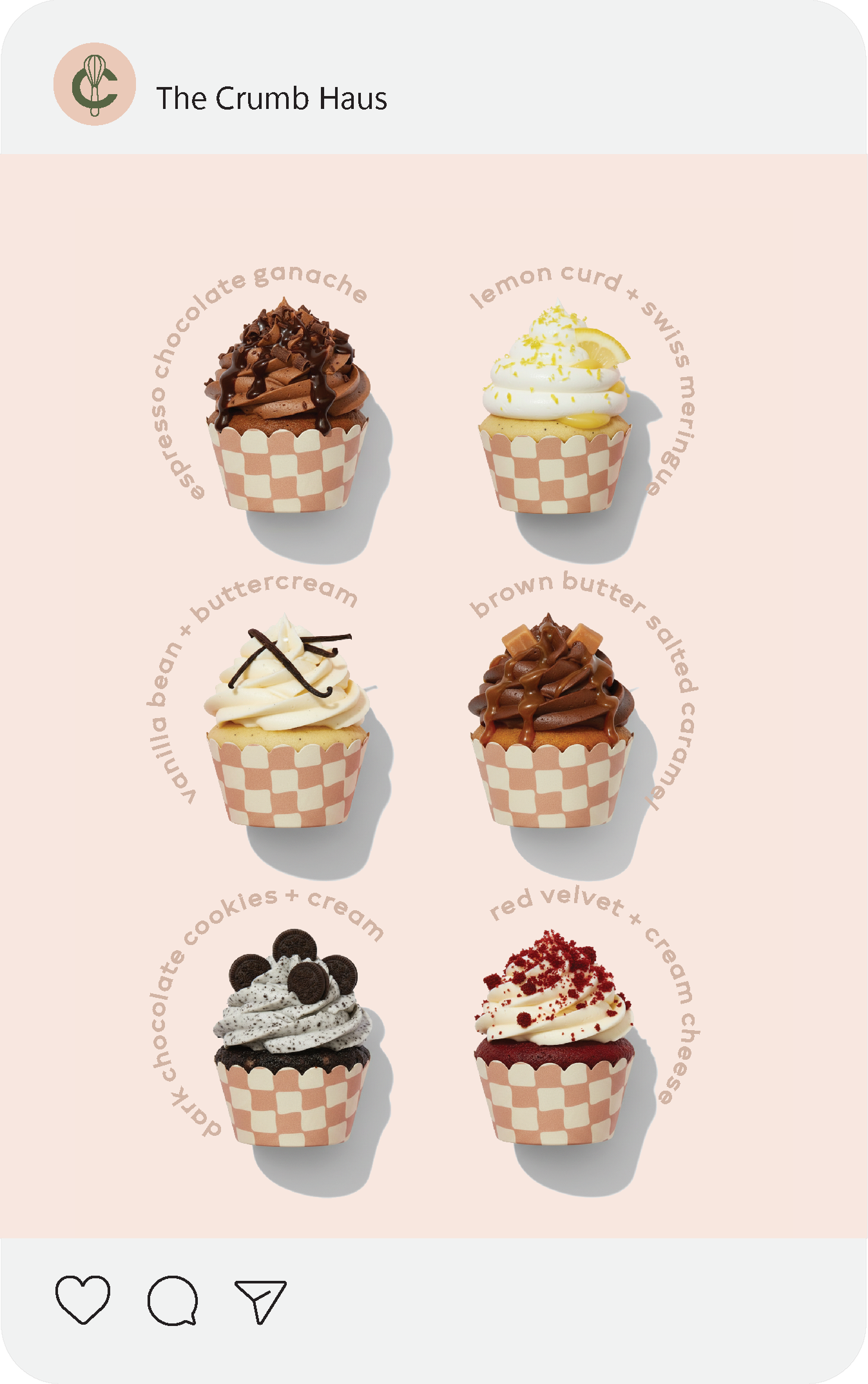
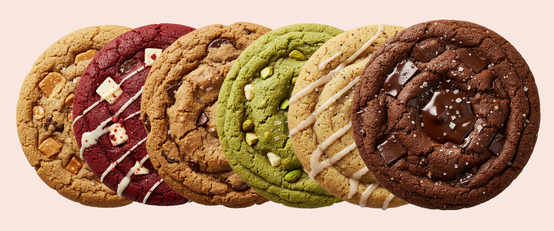
VISUAL EXPRESSION
Design Intent
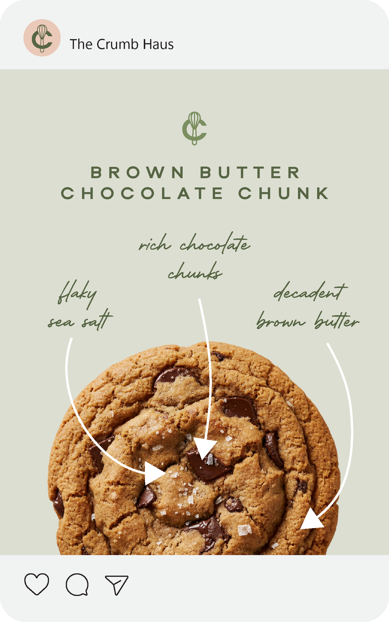
The Crumb Haus identity was created to strike a balance between whimsical comfort and intentional craft. Inspired by the cozy familiarity of home baking, we leaned into bold typography and soft color storytelling to suggest warmth and play, while preserving refinement that keeps the brand feeling fresh rather than juvenile. Illustrative elements and patterns were developed to feel tactile and friendly - adding personality without sacrificing cohesion across touchpoints.


System in Application
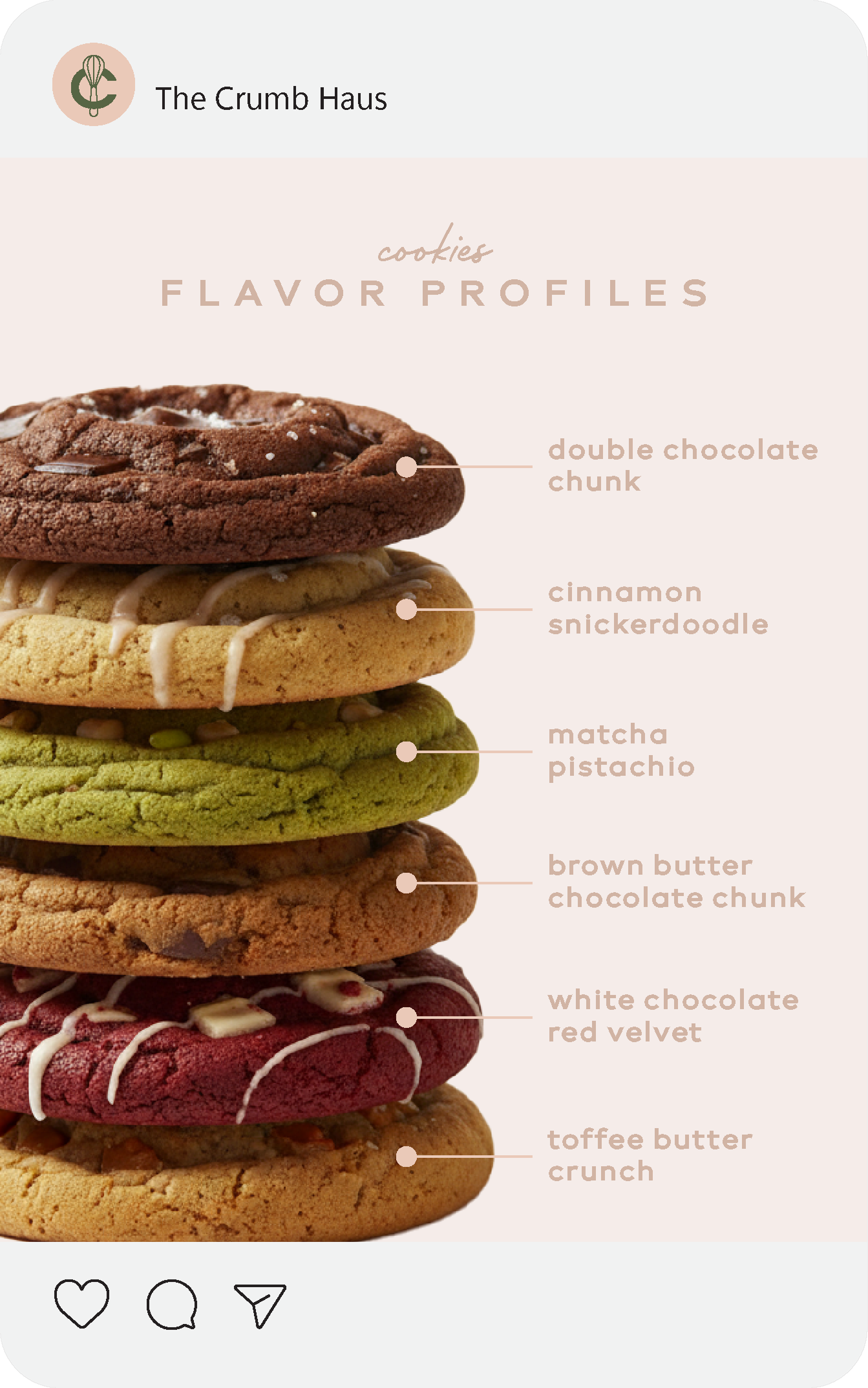
The Crumb Haus visual system was designed to work cohesively across packaging, pattern systems, and supplementary touchpoints such as iconography and social templates. Each element supports the core idea of balanced playfulness: typography maintains structure, colors and illustrations bring warmth, and patterns reinforce recognition - all while keeping the brand optimistic and inviting.