
Auréa
Brand identity & intentional visual system
Aurèa is a conceptual skincare brand rooted in quiet luxury and intentional daily rituals — a visual exploration of refined calm and everyday presence.
This project explores brand positioning, visual identity, and packaging direction for a modern, design-conscious skincare audience.
ART DIRECTION
BRAND IDENTITY
PACKAGING
TYPOGRAPHY


Project Overview
Conceptual brand identity and packaging system
Project Type
Quiet luxury · Ritual-led design · Visual restraint
Focus
Scope & Deliverables
A cohesive brand system spanning visual identity, typography, packaging, and digital expression.

Design Intent
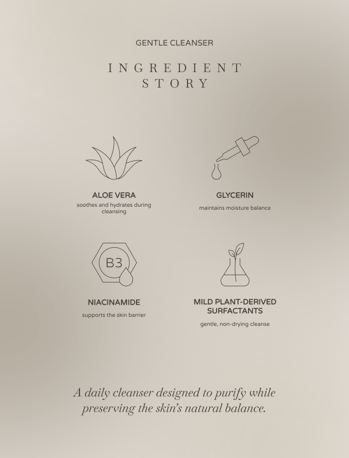
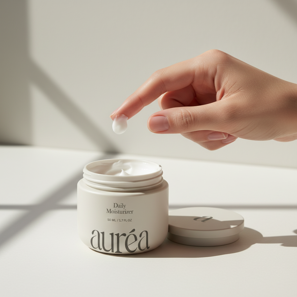
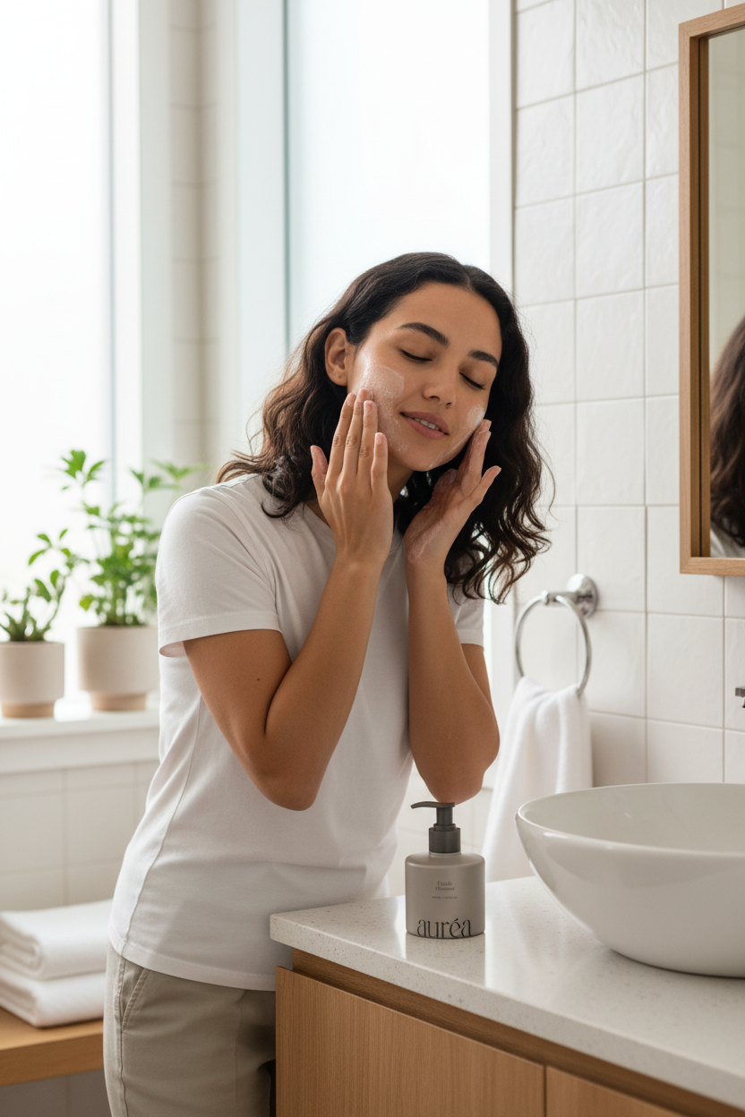
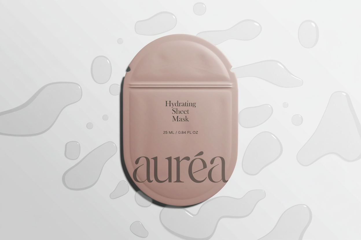
Aurèa was designed to feel refined yet approachable - balancing softness with structure. The visual language prioritizes restraint, warmth, and clarity, creating a sense of ritual and longevity rather than leaning into trend-driven beauty aesthetics.
Typography, spacing, and tone were treated as foundational elements of the system, allowing the brand to feel cohesive across packaging and digital touchpoints while maintaining a calm, elevated presence.

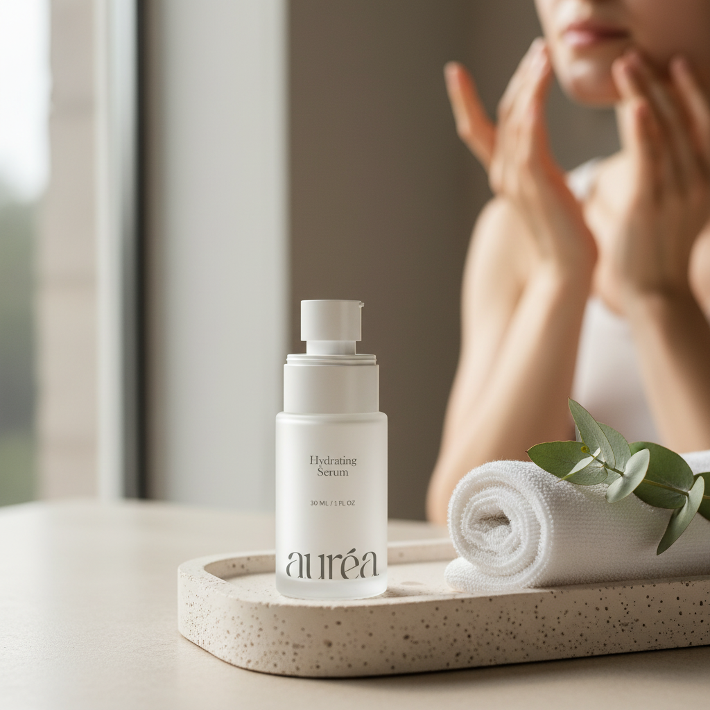
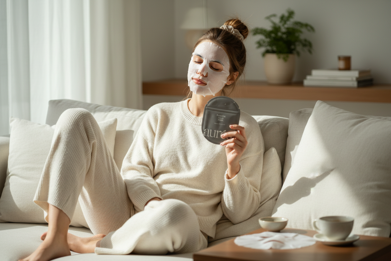
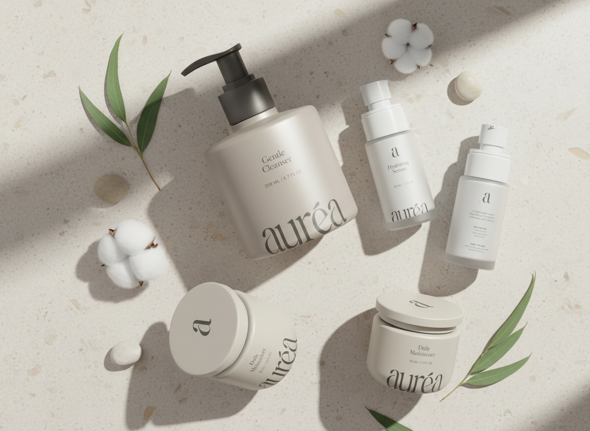

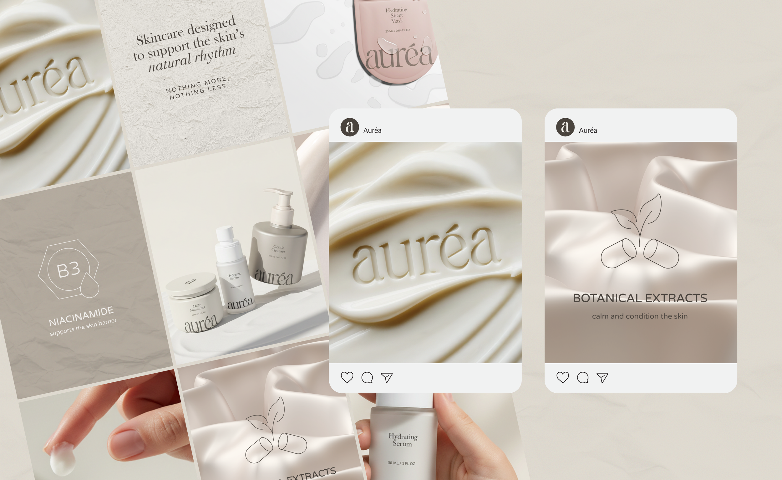
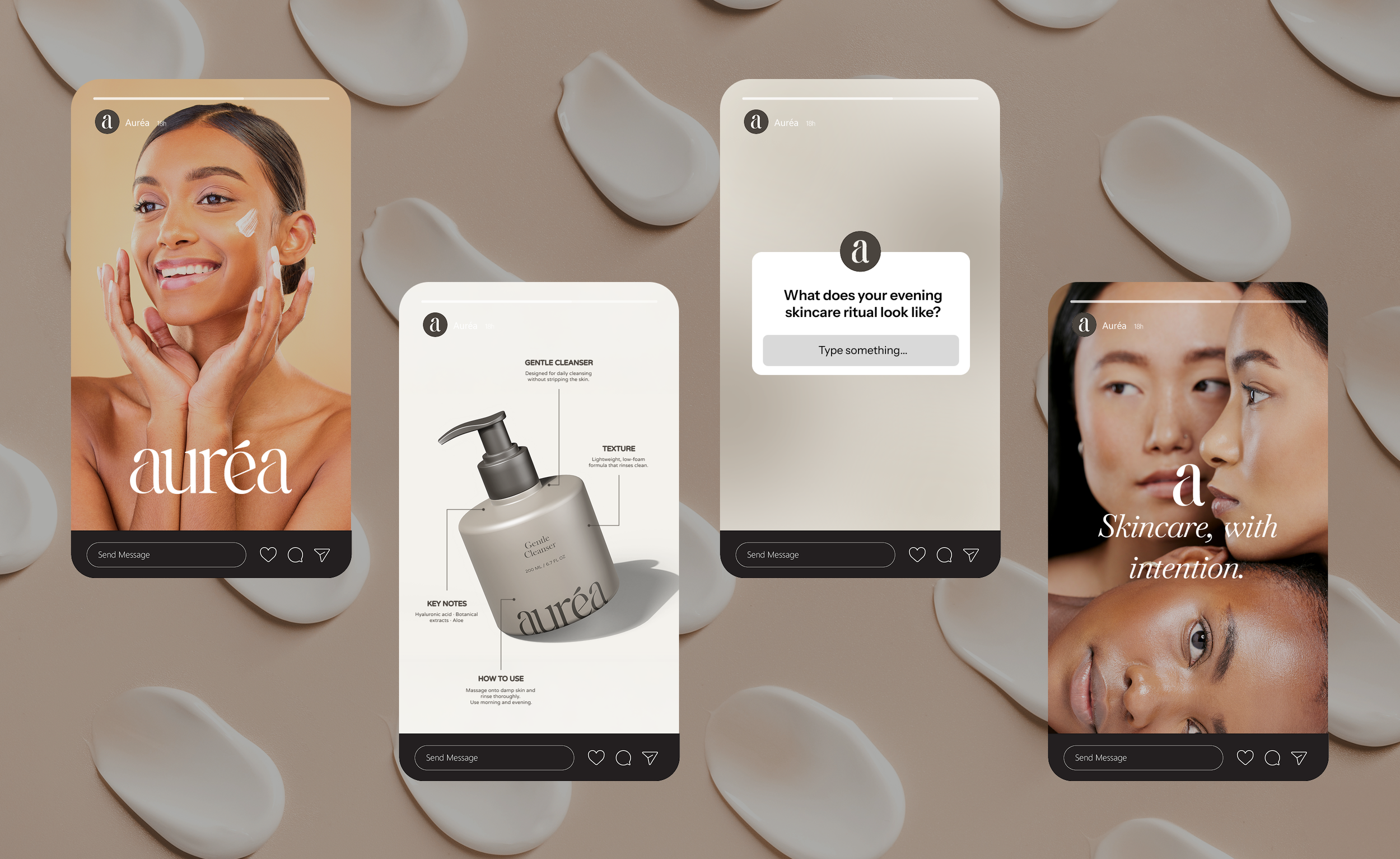
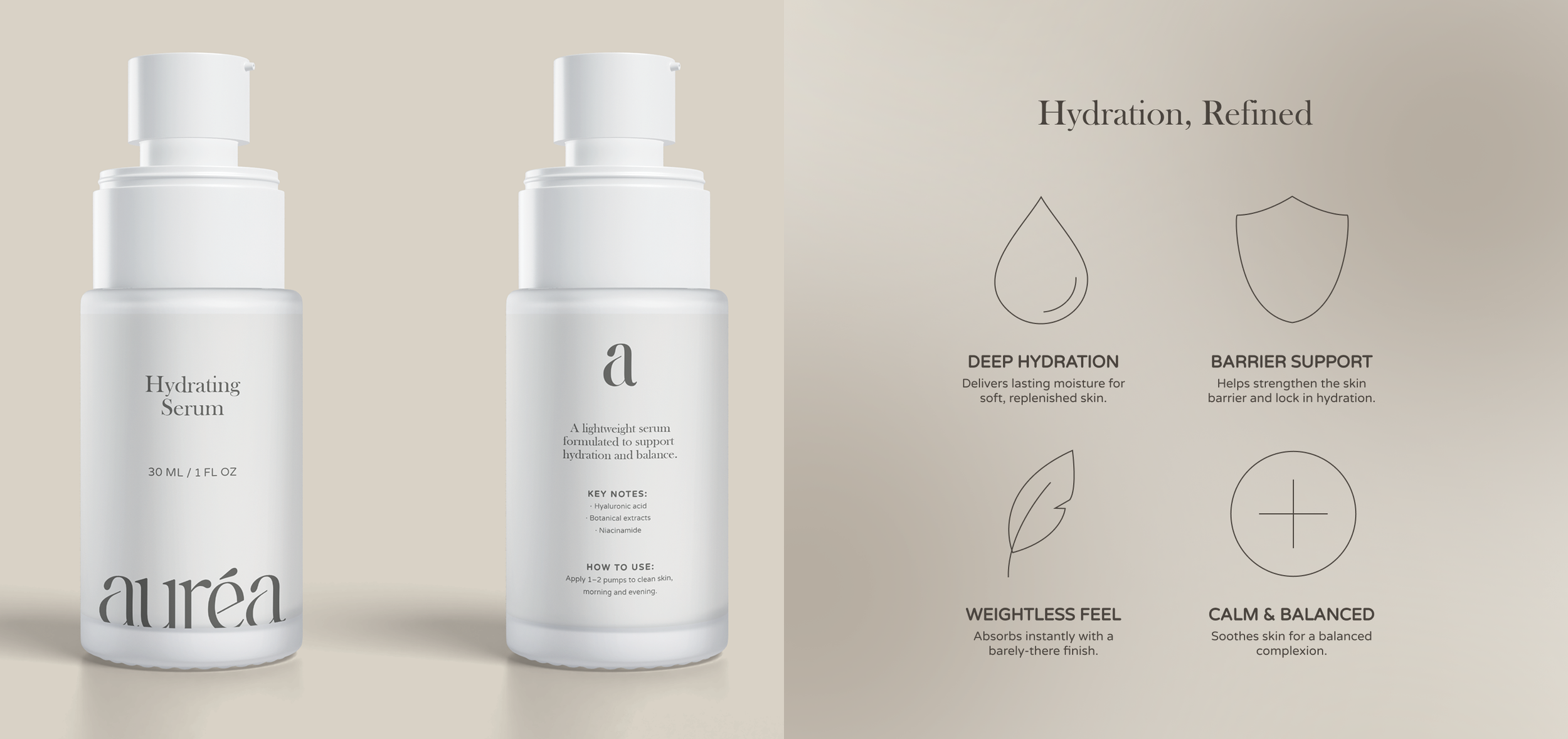
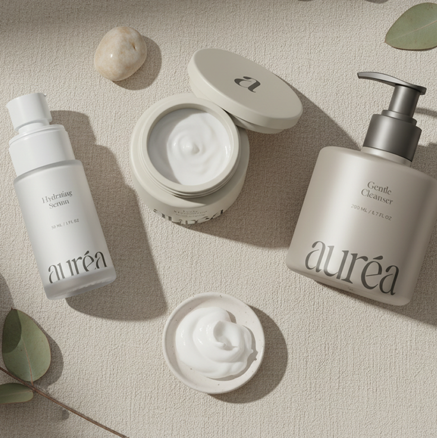
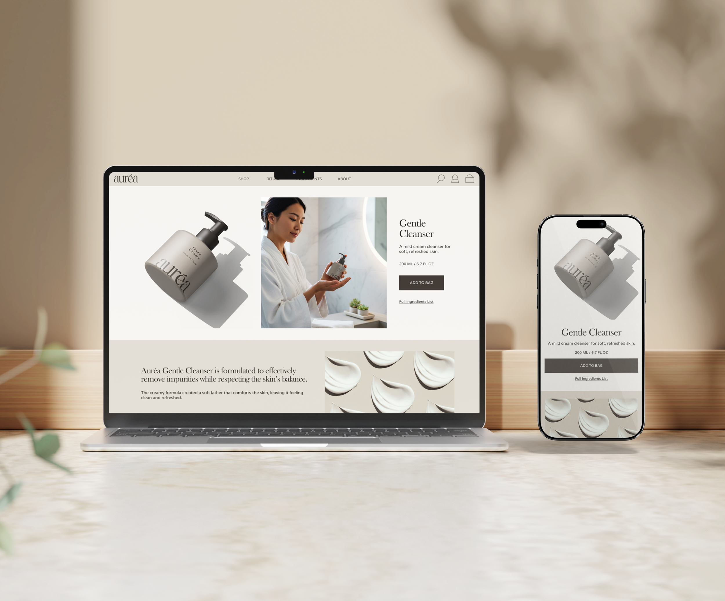
System in Application
The Aurèa visual system was designed to scale seamlessly across packaging and digital environments. From product labels to social touchpoints, each element works cohesively to maintain clarity, consistency, and a refined brand presence.
The result is a flexible system that supports growth while preserving the brand’s quiet, intentional character.